


Stichting Emovere
Organization focused on creating emotional awareness, with the goal of recovering inexplicable pain complaints
Introduction
Stichting Emovere is a non-profit organization dedicated to helping people understand the emotional side of ongoing physical (pain) complaints, with the goal of supporting recovery and preventing chronic suffering. Their approach is built around three strategic pillars: Inspiratie (Inspiration), Verdieping (Deepening), and Verbinding (Connection). These pillars guide all of their activities, from raising awareness and sharing knowledge to fostering a supportive community.
UX Audit
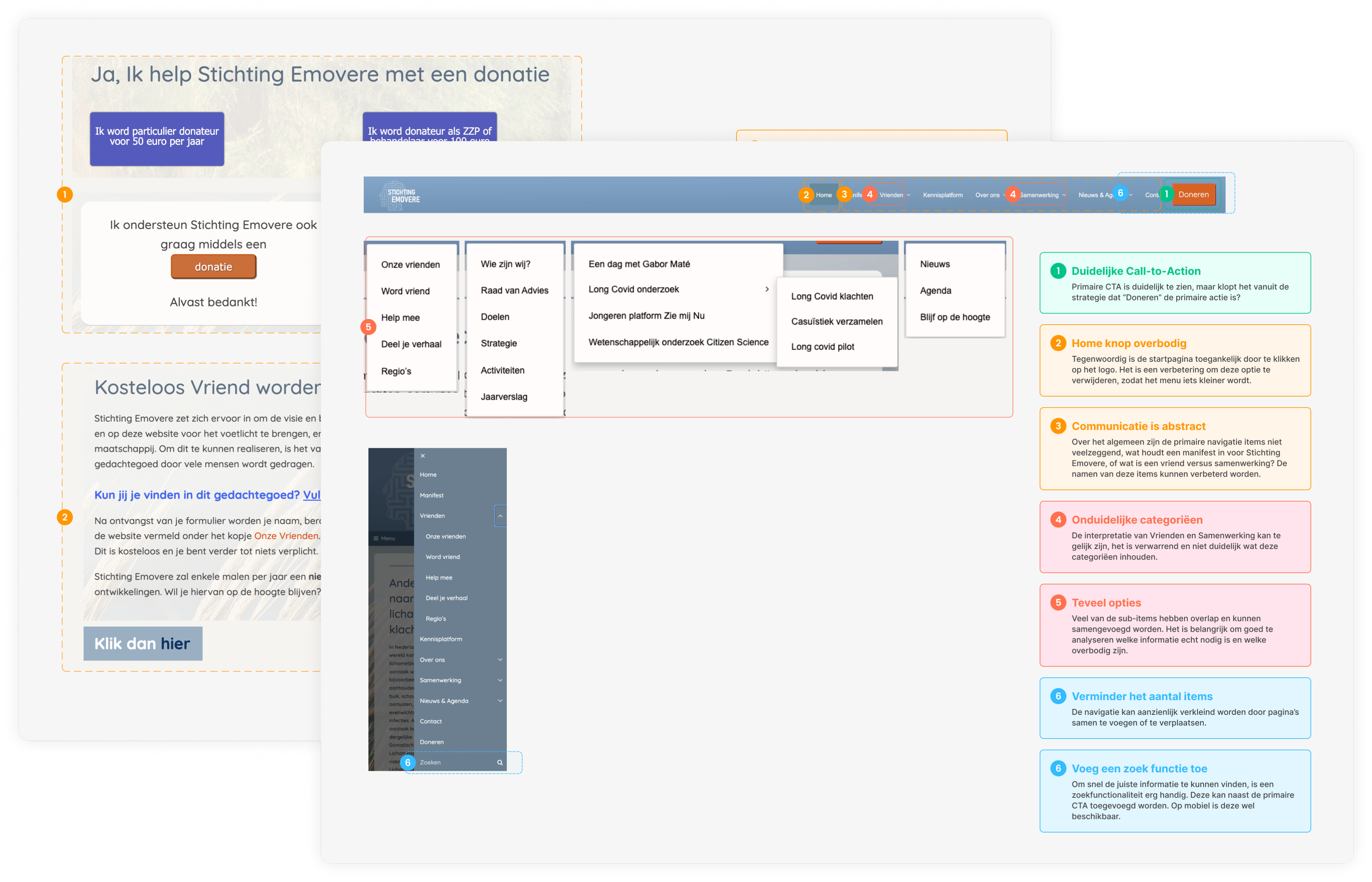
I started the process with a UX audit to identify the usability issues of the website. The findings have been divided into 5 categories.
Key takeaways
- The website can have more consistency in terms of style, grids, backgrounds and font sizes
- Accessibility isn't always accounted for in terms of color contrasts
- The visual hierarchy is lacking in many places of the website, this makes it difficult to understand the relevance of information
- The main navigation was overcrowded with too many options, making it hard for users to choose where to go
- The website uses abbreviations and jargon that can be unclear to new visitors, the communication can be improved in terms of complexity and length
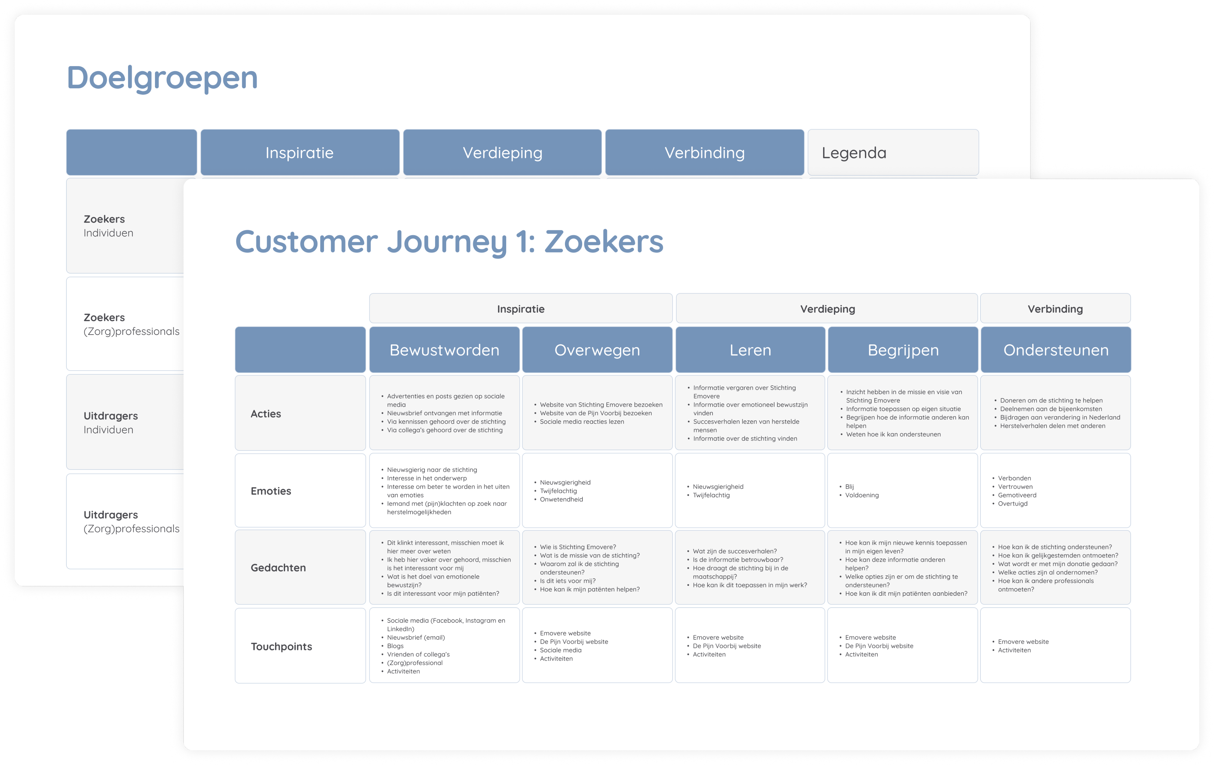
Target Group & Customer Journey
After the audit, I defined the target group and customer journeys in collaboration with the director/co-founder, brand manager and other stakeholders.
Design Improvements
Based on the UX Audit, research about the target group, creating the customer journeys and identifying the brand strategy of the organization, I worked on the improvements for the website.
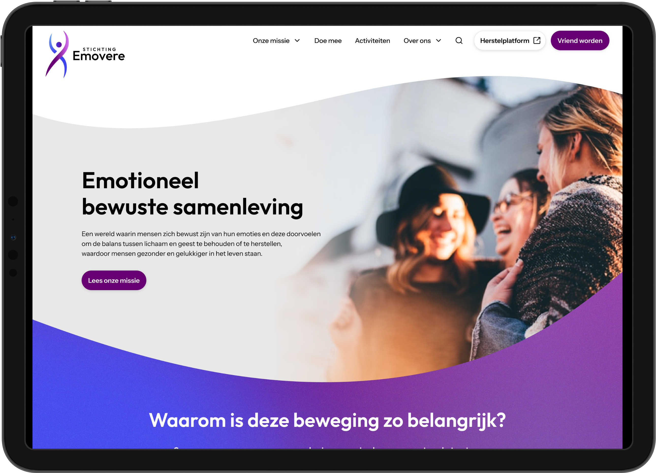
- Simplification
The website had a lot of content that was not clearly presented. For especially new visitors it's not easy to find information about the vision and goal of this organization. One of the key improvements was to simplify the website by improving the main navigation, and reducing the amount of content on the homepage
- Consistency
In the audit I found many inconsistencies in different components. Therefore, I took the time to define the design principles for different components to create consistency for the website. This will make sure the experience feels and works the same throughout the whole website
- Visual hierarchy
Lastly, I want to provide visual hierarchy to make the content and information easier to scan and find. In addition, I want to add more images and rules for primary, secondary and tertiary levels of information / call-to-actions
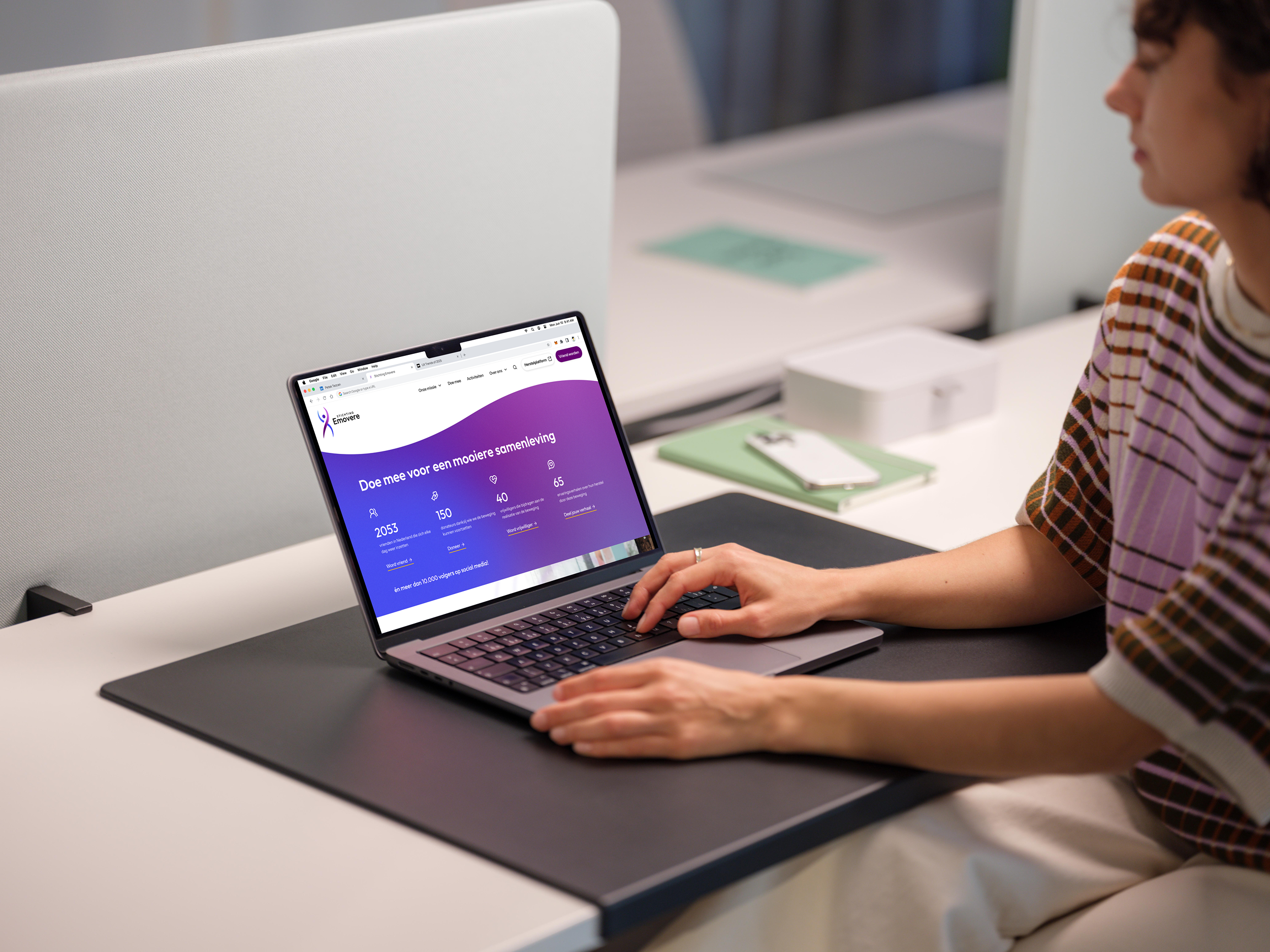
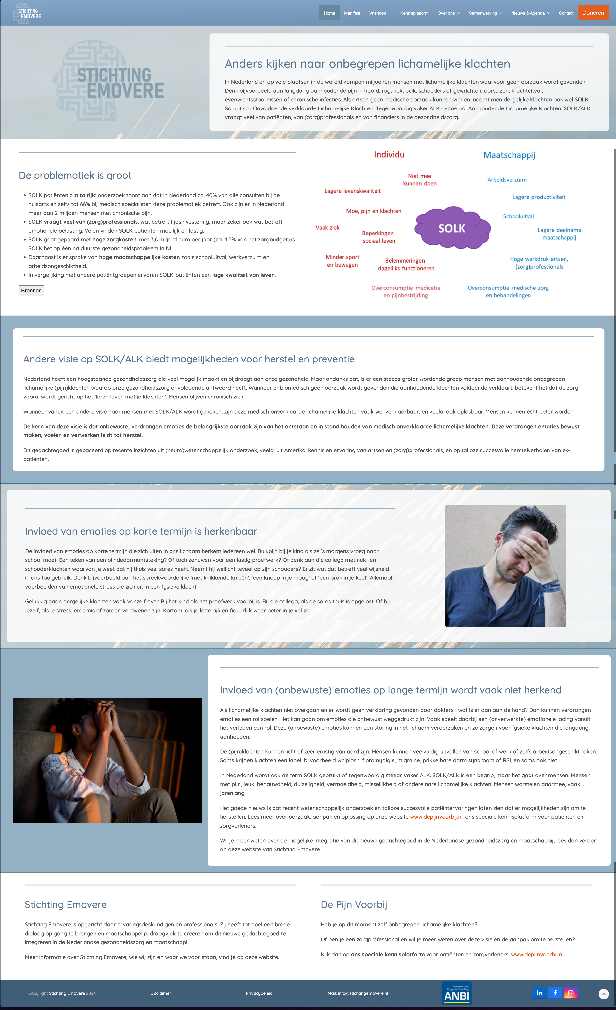
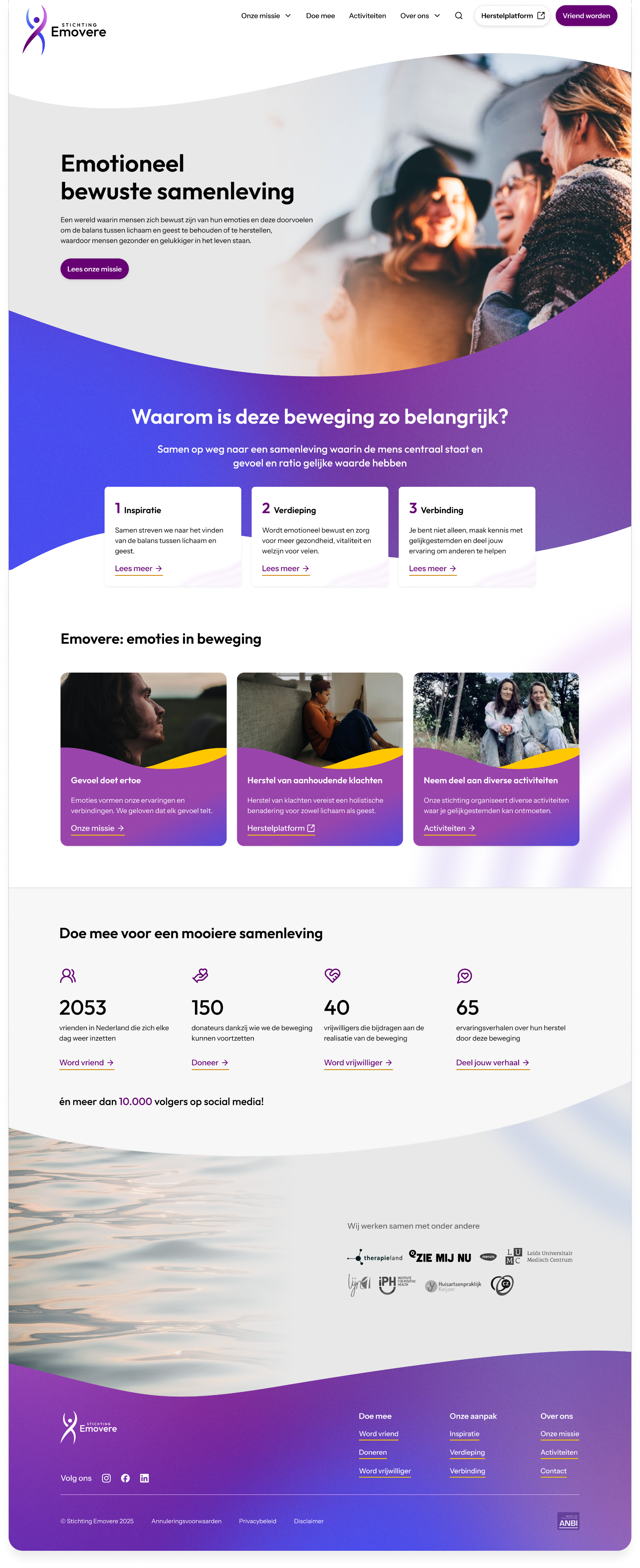
Old vs. New Homepage
Scroll in the frames to view the pages


© 2026 Petek Tezcan. All rights reserved.